• Skip to primary navigation
  • Skip to main content

WPO+

  • WordPress
  • SEO Optimization
  • Events

How-to avoid non-composited animations to improve PageSpeed

February 23, 2023 by Ivan Leave a Comment

Optimize CSS animation properly

Optimizing CSS animations is an important step in improving website performance and user experience.

Here are some tips for optimizing CSS animations:

  1. Reduce the number of animations: Avoid adding too many animations on a single page as this can cause the page to load slowly.
  2. Use hardware-accelerated animations: Use CSS properties such as “transform” and “opacity” for hardware-accelerated animations. This will help the animation run smoothly, especially on mobile devices.
  3. Use “will-change”: Use the “will-change” property to let the browser know that a particular element will be animated, so it can optimize the rendering accordingly.
  4. Optimize keyframes: Be mindful of the number of keyframes used in an animation. Too many keyframes can cause the animation to become choppy.
  5. Use animation-fill-mode: Use the “animation-fill-mode” property to specify what happens to an element before and after an animation is run.
  6. Avoid unnecessary animations: Avoid animating elements that do not need to be animated, as this can increase page load time and make the website feel sluggish.

By following these tips, you can create smooth and efficient CSS animations that enhance your website’s user experience.

Non-composited animation performance

Non-composited animations require expensive calculations on every frame, which can lead to slow page loading times and a sluggish user experience. To avoid non-composited animations, you should use CSS animation properties that are handled by the compositor alone.
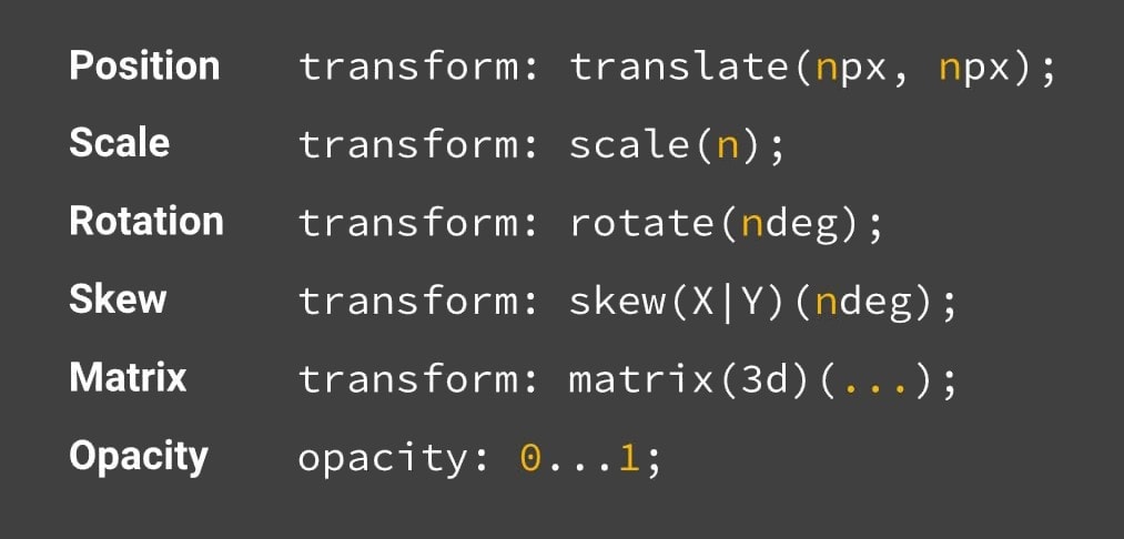
These include:

  • opacity: 0…1 – to change the visibility and colors of the elements
  • transform: translate(npx, npx) – for element’s position change
  • transform: scale(n) – to scale elements
  • transform: rotate(ndeg) – to rotate elements
  • transform: skew(X|Y)(ndeg) – to skew elements
  • transform: matrix(3d)(…) – 3D transformation

By using these properties, the browser can handle the animation more efficiently, resulting in a smoother user experience.

The composited animation

In addition, you can use the “will-change: transform;” property [“transform: translateZ(0);” – for older browsers] to let the browser know that a particular element will be animated, so it can optimize the rendering accordingly. This can help improve performance for more complex animations.

Overall, avoiding non-composited animations and using composited properties can significantly improve website performance and user experience.

FLIP Approach

The FLIP [First, Last, Invert, Play] approach proposes to replace the expensive calculation of the element’s color animation change with the element’s opacity change where possible.

Non-composited animation FAQ

How do you avoid non-composited animations in CLS?

CLS (Cumulative Layout Shift) is a measure of how much the content of a page shifts around while the page is loading, which can be caused by non-composited animations among other factors. Avoiding non-composited animations can help reduce CLS and improve the user experience.

To avoid non-composited animations in CLS use the CSS properties that are handled by the browser’s compositor, such as “transform” and “opacity”.

What are non-composited animations?

Non-composited animations are animations that require expensive calculations on every frame and are not handled by the browser’s compositor. Instead, they rely on the CPU to calculate the animation at each frame, which can lead to slow page loading times and a sluggish user experience.

Non-composited animations are typically animations that involve changing the layout of an element or its properties, such as its color, width, or height. For example, animating the width of an element by changing its CSS “width” property can be a non-composited animation.

On the other hand, composited animations are animations that are handled by the browser’s compositor, which is a hardware-accelerated layer in the browser that is optimized for animation. Composited animations typically involve changes to the position or opacity of an element, which can be handled more efficiently by the browser’s compositor.

What is composition in animation?

Composition in animation refers to the process of combining multiple visual elements or layers to create a final animation. In the context of web development, it refers to the way that the browser combines and renders visual elements on a webpage, including animations.

The browser’s compositor is a hardware-accelerated layer that is optimized for animation and handles the composition of visual elements on the page. Compositing involves taking individual layers or elements and combining them into a single image that is displayed on the screen. The compositor calculates the position, opacity, and other properties of each element to create the final image.

By using composited properties in web animations, such as “transform” and “opacity”, developers can take advantage of the browser’s compositor to create smooth, efficient animations that do not slow down the page loading time or cause visual glitches. Non-composited animations, on the other hand, require expensive calculations on every frame and can lead to slow page loading times and a poor user experience.

Filed Under: Core Web Vitals, Content, Usability Tagged With: animation, PageSpeed

Reader Interactions

Leave a Reply Cancel reply

Your email address will not be published. Required fields are marked *

Yes, this website is not perfect, but we are working over it...